Saturday, December 29, 2012

Pie charting with gnuplot

In two of my previous posts (post-1 post-2), I have talked about how to plot a pie chart using gnuplot. This time I will introduce a new method witch is much more simpler.

This new method will use the plotstyle "circle". And this feather is not provide since gnuplot version 4.6. So you have to update your gnuplot to a version not lower than 4.6.

set term post eps color enhanced size 5cm,5cm
set output "pie_chart.eps"

set size square
set xrange [-1:1]
set yrange [-1:1]
set style fill solid 1

unset border
unset tics
unset key

plot '-' with circle linecolor var
0 0 1 0   30  1
0 0 1 30  60  2
0 0 1 60  120 3
0 0 1 120 190 4
0 0 1 190 275 5
0 0 1 275 360 6
e
##the first two numbers 0 0 are the
# x and y coordinate of center
##the third number 1 is the radius
#of the circle
##the fourth and fifth number are the
#begin and end angle of the sector
##the last number is the color indicate

set output

Fig.1 Pie charting using gnuplot

Friday, November 30, 2012

Plot a pie chart using gnuplot

If your gnuplot version is not lower than 4.4, then plotting a pie chart can be done with command "set object circle...". The following is an example.

reset
set term postscript eps color enhanced size 5cm,5cm
set output "pie_chart.eps"

set size square
set style fill solid 1.0 border -1

set object 1 circle at screen 0.5,0.5 size \
  screen 0.45 arc [0   :50  ] fillcolor rgb "red" front
set object 2 circle at screen 0.5,0.5 size \
  screen 0.45 arc [50  :150] fillcolor rgb "orange" front
set object 3 circle at screen 0.5,0.5 size \
  screen 0.45 arc [150:220] fillcolor rgb "forest-green" front
set object 4 circle at screen 0.5,0.5 size \
  screen 0.45 arc [220:360] fillcolor rgb "dark-magenta" front

#plot a white line, i.e., plot nothing
unset border
unset tics
unset key
plot x with lines lc rgb "#ffffff"
set output

Fig.1 Plot a pie chart using gnuplot

If you think setting of the position, size and arc manually is very tedious, you may write a script with any programming language.

Follow this link to see a new simpler method to plot a pie chart.


Wednesday, October 31, 2012

Convertting a rgb color value to its hex-string

In a previous post, I have talked about how to convert a hex-string color to its rgbvalue. This time I will talk about the inversion, i.e., converting a rgb value color specification to its hex-string correspondence.

#pick the red color value out
red(rgbvalue)=rgbvalue/65536
#pick the green color value out
green(rgbvalue)=(rgbvalue%65536)/256
#pick the blue color value out
blue(rgbvalue)=rgbvalue%256
#convert dec color value to its hex string
dec2hex(dec)=gprintf("%02x",dec)
#convert rgb color value to its hex string
rgb2hex(color)="#".\
               dec2hex(red(color)).\
               dec2hex(green(color)).\
               dec2hex(blue(color))

color = 65535 #rgb-value 
print "The hex string of rgb-color ". color ." is: "
print rgb2hex(color)
plot cos(x) w line linecolor rgb rgb2hex(color)

Run this script, it will output the following string and picture.

The hex string of rgb color 65535 is: 
#00ffff

Fig.1 Converting from a rgb color specification to its hex-string


Saturday, September 29, 2012

Self-defined linestyle under gnuplot postscript terminal

In post http://gnuplot-surprising.blogspot.com/2012/07/self-defined-linestyle-under-gnuplot.html we have talked about self-defined linestyle under gnuplot svg terminal. Here we show how to realize the same effect under postscript terminal.

Assume you have plotted a graph using the following script.

set term post eps color enhanced
set output "self-defined_linestyle.eps"

plot sin(x) w l linestyle 1

set output

Open the outputed ps (or eps) file with any text editor, and find codes as the following:

% Default Line colors
/LCw {1 1 1} def
/LCb {0 0 0} def
/LCa {0 0 0} def
/LC0 {1 0 0} def
/LC1 {0 1 0} def
/LC2 {0 0 1} def
/LC3 {1 0 1} def
/LC4 {0 1 1} def
/LC5 {1 1 0} def
/LC6 {0 0 0} def
/LC7 {1 0.3 0} def
/LC8 {0.5 0.5 0.5} def
% Default Line Types
/LTw {PL [] 1 setgray} def
/LTb {BL [] LCb DL} def
/LTa {AL [1 udl mul 2 udl mul] 0 setdash LCa setrgbcolor} def
/LT0 {PL [8 dl1 1 dl2 1 dl1 1 dl2] LC0 DL} def
/LT1 {PL [4 dl1 2 dl2] LC1 DL} def
/LT2 {PL [2 dl1 3 dl2] LC2 DL} def
/LT3 {PL [1 dl1 1.5 dl2] LC3 DL} def
/LT4 {PL [6 dl1 2 dl2 1 dl1 2 dl2] LC4 DL} def
/LT5 {PL [3 dl1 3 dl2 1 dl1 3 dl2] LC5 DL} def
/LT6 {PL [2 dl1 2 dl2 2 dl1 6 dl2] LC6 DL} def
/LT7 {PL [1 dl1 2 dl2 6 dl1 2 dl2 1 dl1 2 dl2] LC7 DL} def
/LT8 {PL [2 dl1 2 dl2 2 dl1 2 dl2 2 dl1 2 dl2 2 dl1 4 dl2] LC8 DL} def

In the upper codes "/LC? {# # #} def" defines the line color, and "/LT? {Pl [#1 dl1 #2 dl2]LC?} def" defines the line type. "#1 dl1 #2 dl2" means the line is a dash line with #1 legth colored and #2 length blank.

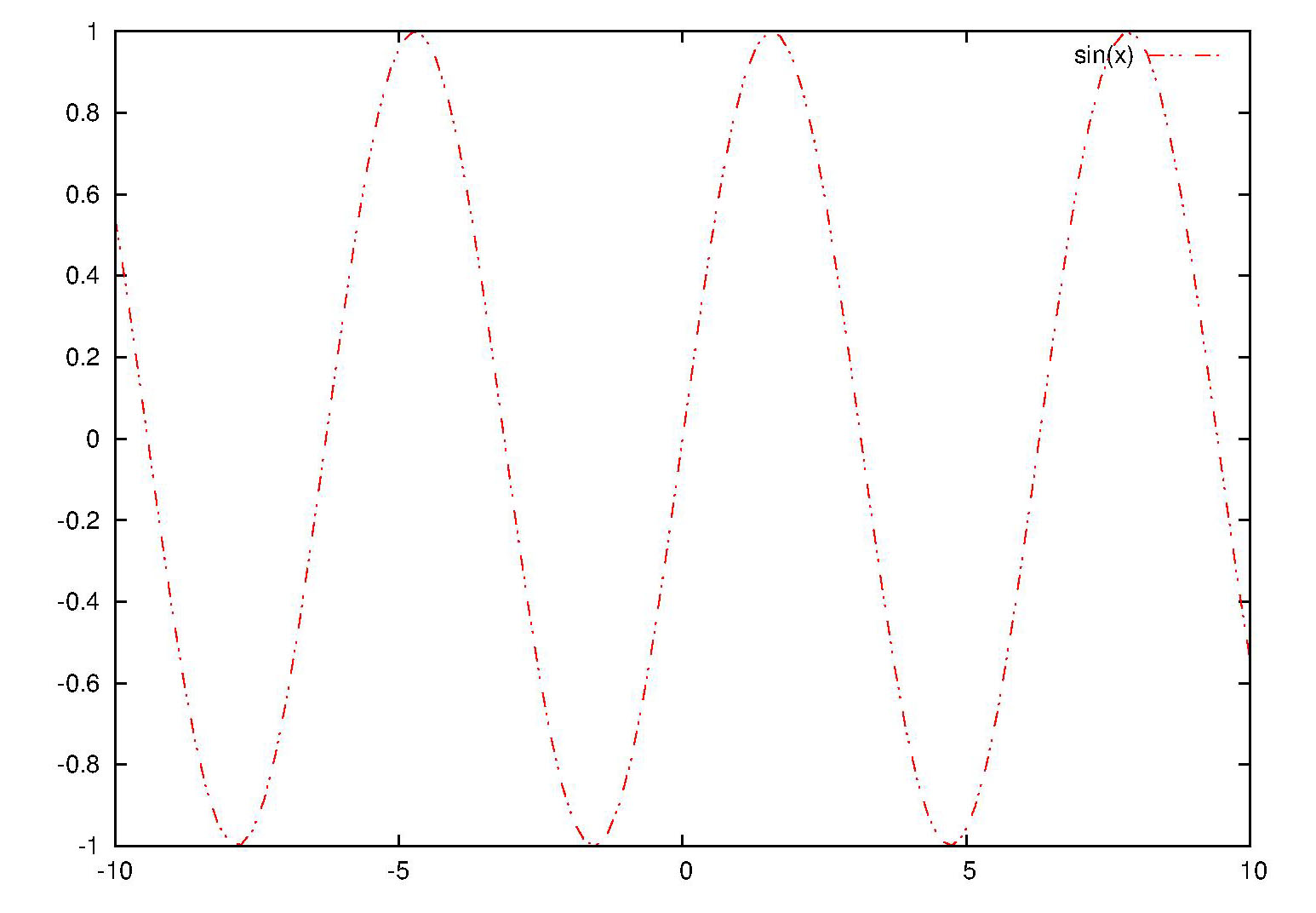
Modify these codes as what you like, and save the file. For example, I use "/LT0 {PL [8 dl1 4 dl2 1 dl1 4 dl2 1 dl1 8 dl2] LC0 DL} def" to repalce the original "/LT0 {PL [] LC0 DL} def".

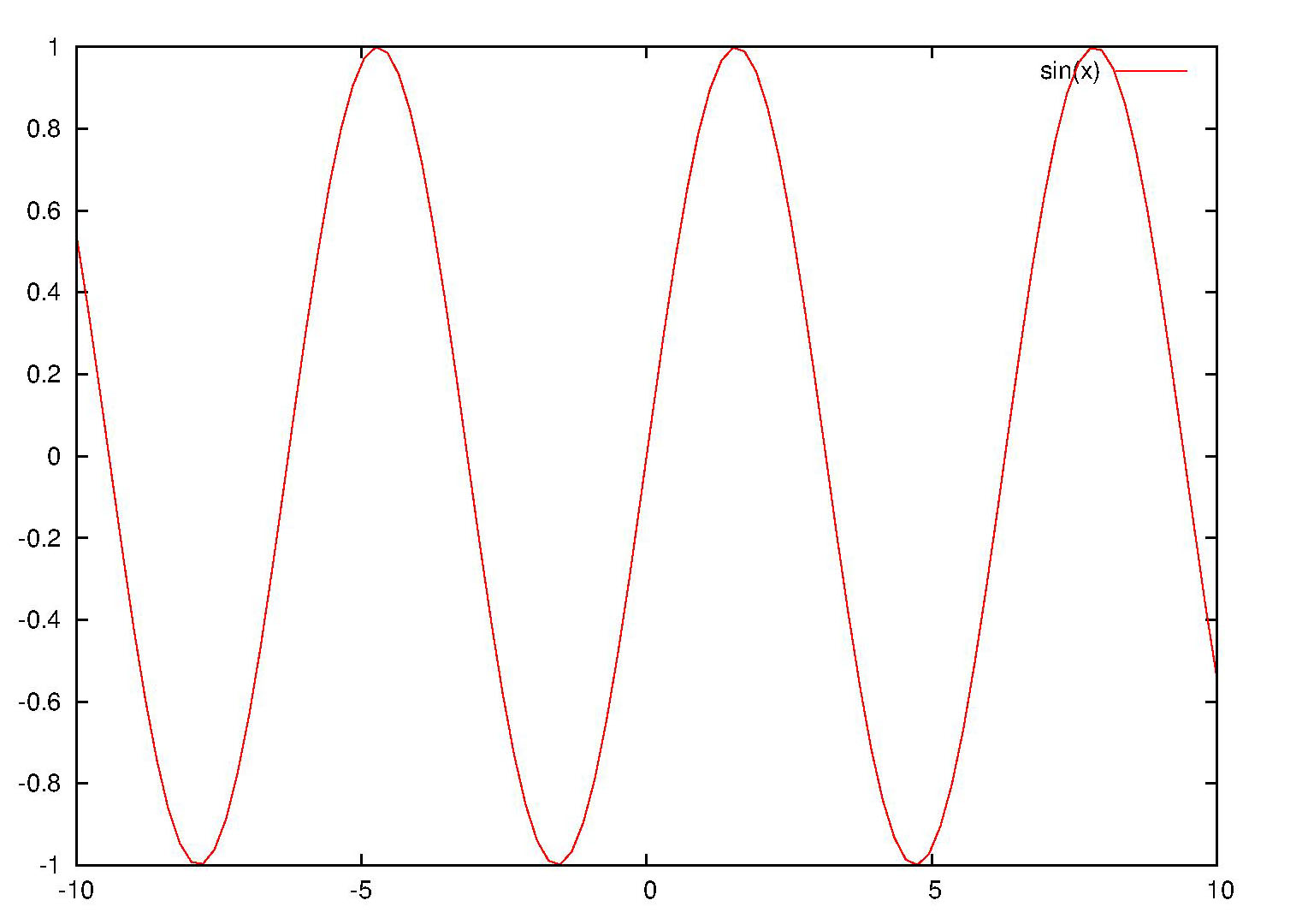
At last, open the modified postscript file with gsview (or any other postscript viewer), and you will find the linestyle have been changed. The following is the original and modifed graph respectively.

Fig.1 Original outputted picture
Fig.2 Modified outputted picture


Friday, August 24, 2012

Converting from a hex-string color to its rgbvalue

There are several ways to specify color when one plots using gnuplot.Among them hex-string (like "#0000ff") and rgbvalue (like "256") specification is very important. In this post we will talk about converting from a hex-string color to its rgbvalue (the inversion will be talked in another post).

reset
#pick the red color hex string out
red(colorstring)= colorstring[2:3]
#pick the green color hex string out
green(colorstring)=colorstring[4:5]
#pick the blue color hex string out
blue(colorstring)=colorstring[6:7]
#convert a hex string to its dec format
hex2dec(hex)=gprintf("%0.f",int('0X'.hex))
#calculate the rgb value from the r,g,b weight
rgb(r,g,b) = 65536*int(r)+256*int(g)+int(b)
#convert the hex color string to its rgb value.
hex2rgbvalue(color)=rgb(\
                        hex2dec(red(color)),\
                        hex2dec(green(color)),\
                        hex2dec(blue(color))\
                        ) 
set term png
set output "hex_string2rgbvalue.png"
plot 'color.dat' u 1:2:(hex2rgbvalue(stringcolumn(3)))\
              w lp pt 7 ps 3 lc rgb variable notitle
set output

File 'color.dat' has content like the following:
0 1 #ff0000
1 2 #00ff00
2 3 #0000ff
3 4 #ff00ff
4 5 #ffff00
5 6 #00ffff
0 6 #00ffff
1 5 #ffff00
2 4 #ff00ff
3 3 #0000ff
4 2 #00ff00
5 1 #ff0000

The output file 'hex_string2rgbvalue.png' looks like this:
Fig.1 Converting from a hex-string color to its rgb-value

Saturday, July 7, 2012

Self-defined linestyle under gnuplot svg terminal

Gnuplot have defined a series of line styles. But maybe you still have not find the one which is just appropriate for you. For example,when you want to use a dash-dot-dot line, you find there is not such a linestyle.

When you are using svg teminal (self-defined linestyle under postscript terminal will be talked in another post) this problem can solved easily. Fisrt, plot your file with solid line.

set term svg
set output "sin.svg"
plot sin(x) with line
set output

After that, open the svg file with a text-editor, and find codes like the following:

<g id="gnuplot_plot_1" >
<title>gnuplot_plot_1</title>
<g style=" fill:none; color:red; 
  stroke:currentColor; stroke-width:1.00; 
  stroke-linecap:butt; stroke-linejoin:miter">

Then change it to

<g id="gnuplot_plot_1" >
<title>gnuplot_plot_1</title>
<g style="stroke-dasharray: 7,2,2,2,2,2; 
  fill:none; color:red; stroke:currentColor; 
  stroke-width:1.00; stroke-linecap:butt; 
  stroke-linejoin:miter">

This time open your svg file, and you find the line sytle has changed. The follwing picture is a screen capture of "sin.svg".

Fig.1 Self-defined linestyle under gnuplot svg terminal

To further understand this post, you may google "stroke-dasharray + svg".

Monday, June 4, 2012

Plot an interactive svg graph using gnuplot

In this post an example of plotting an interactive svg graph using gnuplot is talked.

First, run the following gnuplot plotting script.

set term svg mouse jsdir "./js"  
set output "sincos.svg"
plot sin(x) w l lc rgb"#ff0000", cos(x) w l lc rgb"#00ff00"
set output

And a file called "sincos.svg" is plotted. As we specified in the script that the javascript file is in directory "./js", "gnuplot-dir/share/js" have to be copied to the current directory (windows operating system, and if you use linux maybe the directory should be /usr/local/share/gnuplot/gnuplot-version/js). This time open the file, and you can find when you click the graph, the coordinate of the current point will be displayed. And when you click the legend, the cooresponding line will be invisible, and click it again, the line will visible.

The jsdir can also be a url location. And this is is usually appropriate if you are embedding the svg into a web page. For example, command --- set term svg mouse jsdir "http://gnuplot.sourceforge.net/demo_svg_4.6/" can be used.

set term svg mouse jsdir "http://gnuplot.sourceforge.net/demo_svg_4.6/"
set output "sincos.svg"
plot sin(x) w l lc rgb"#ff0000", cos(x) w l lc rgb"#00ff00"
set output

Saturday, May 19, 2012

How to pick out the maximum and minimum points when plotting with gnuplot?

Picking out the maximum and minimum points from a data file may be useful when you want to make some explanation to your graph. It is known that GPVAL_Y_MAX (GPVAL_Y_MIN) is the maximum (minimum) value. But what is the corresponding X coordinate?

With Gnuplot 4.6 the both the x and y coordinate of maximum and minimum points can be find out easily. The method is using new command "stats". This command is used for statistic. When it is run, some statistical results will be gotten. If your data file contains two column of data, (STATS_pos_max_y, STATS_max_y) will be the coordinate of the maximum point and (STATS_pos_min_y, STATS_min_y) will be the coordinate of the minimum point.

For example, we have a data file named "data.dat" like this

0.1     0.289010715
0.2     0.050630492
0.3     0.721247895
0.4     0.284271151
0.5     0.505051253
0.6     0.101819025
0.7     0.008466133
0.8     0.36249047
0.9     0.487576233
1.0     0.595090343
1.1     0.865255938
1.2     0.696628854
1.3     0.505899456
1.4     0.338131983
1.5     0.108034045

Run a gnuplot script as follows

reset
set term png
set output "max_min.png"
stats "data.dat" u 1:2 nooutput
set xrange [STATS_min_x:STATS_max_x]
set label 1 "Maximun" at STATS_pos_max_y, STATS_max_y offset 1,-0.5
set label 2 "Minimun" at STATS_pos_min_y, STATS_min_y offset 1,0.5
plot "data.dat" w p pt 3 lc rgb"#ff0000" notitle, \
     STATS_min_y w l lc rgb"#00ffff" notitle, \
     STATS_max_y w l lc rgb"#00ffff" notitle
set output

And you will get a graph like the following one.
Picking out the maximum and minimum points when plotting using gnuplot

Monday, April 2, 2012

New version of gnuplot makes iterations easy --- animation as an example

Gnuplot4.6 have been released on 2012.03.08. And some new features have been added. Among them, I think block-structured if/else/while/do is the most useful one. With this new feature, one can easily deal with loop. In this post I will talk about this new feature taking animation as an example. In a previous post, how to create a gif animation using gnuplot have been talked. And it seems a little complex. An extra file is needed. Here with this new feature in gnuplot4.6, the work can be done simply as follows:

reset
set term gif animate
set output "animate.gif"
n=24 #n frames
dt=2*pi/n
set xrange [0:4*pi]
set yrange [-1:1]
do for [i=0:n]{
  plot sin(x+i*dt)/(1. + i/12.) w l lw 1.5 title sprintf("t=%i",i)
}
set output
Animation using new fearute of gnuplot4.6


Friday, March 16, 2012

The diffrence among various forms of quotation marks

There are three different forms of quotation marks in gnuplot. They are single quote, double quote and backquote.

The main difference between sing and double quote marks is whether backslash processing of special characters can be used. In double quote the backslash pattern is effective, so if you type in the following command
print "The first line.\nThe second line."
Then it will comes out to be
The first line.
The second line.
While if you type in the command like this:
print 'The first line.\nThe second line.'
Then the out coming string will be
The first line.\nThe second line.

The back quotes have a absolutely different utility. It is used to enclose system commands for substitution into the command lines. (Note that this utility is not supported on all platforms.) For example in a Linux platform you can add a watermark to your graph like this:

set label "By gnuplot-surprising at `date +%Y-%m-%d`" center\
    at screen 0.5,0.5 tc rgb"#cccccc"
plot sin(x)

The watermarked picture looks like this
Back quotes in gnuplot --- substitution

Friday, February 17, 2012

How to plot a cross shaped axis when using gnuplot

It is always asked by my friends that how to plot a graph with cross shaped axis when using gnuplot. To the best of my knowledge, there is not such a built in axis style in gnuplot. So you have to draw the axis manually. Here a script is provided. You can just use it. If you would like to make some improvements, It is welcomed.

#frame.gnuplot
#Author: 数声风笛离亭晚,我想潇湘君想秦
##########################################################
#Utility: plot a "+" style axis

#Usage:
#call "frame.gnuplot" "ox" "oy" "xmin" "xmax" "ymin"\
#     "ymax" "dx" "dy"

#Parameters: 
#(Frame_ox,Frame_oy):     The position of the origin
#(Frame_xmin,Frame_ymin): The bottum-left point
#(Frame_xmax,Frame_ymax): The top-right point
#Frame_dx:                The interval of x-ticks
#Frame_dy:                The interval of y-ticks

#Before calling this script, Frame_xtic_len and 
#Frame_ytic_len can be set to control the length
#of the corresponding tick length. The length is 
#measured in graph coordinate. The default values 
#are 0.02 and 0.01.

#Example:
#Frame_xtic_len = 0.01
#Frame_ytic_len = 0.01
#call "frame.gnuplot" "0." "1.0" "-10." "10." "0." \
#     "2." "2." "0.2"
#plot sin(x)+1.
##########################################################
Frame_ox=$0
Frame_oy=$1
Frame_xmin=$2
Frame_xmax=$3
Frame_ymin=$4
Frame_ymax=$5
Frame_dx=$6
Frame_dy=$7

#set the default value of Frame_x(y)tic_len
if (!exist("Frame_xtic_len")) Frame_xtic_len=0.02
if (!exist("Frame_ytic_len")) Frame_ytic_len=0.01
#no plot of the default border and tics
set border 0
unset tics
#set the xrange and yrange to the user defined value
set xrange [Frame_xmin:Frame_xmax]
set yrange [Frame_ymin:Frame_ymax]
#draw the axis
set arrow from graph 0, first Frame_oy to graph 1.03,\
    first Frame_oy size graph 0.02,15,60 fill ls -1
set arrow from first Frame_ox, graph 0 to first Frame_ox,\
    graph 1.03 size graph 0.015,15,60 fill ls -1
#draw the ticks
set for [i=0:int((Frame_xmax-Frame_xmin)/Frame_dx)] \
    arrow from Frame_xmin+i*Frame_dx,Frame_oy to \
    Frame_xmin+i*Frame_dx,Frame_oy+ \
    (Frame_ymax - Frame_ymin)*Frame_xtic_len nohead
set for [i=0:int((Frame_ymax-Frame_ymin)/Frame_dy)] \
    arrow from Frame_ox,Frame_ymin+i*Frame_dy to \
    Frame_ox+(Frame_xmax - Frame_xmin)*Frame_ytic_len, \
    Frame_ymin+i*Frame_dy nohead
#draw the labels with the ticks
set for [i=0:int((Frame_xmax-Frame_xmin)/Frame_dx)] \
    label sprintf("%3.1f",Frame_xmin+i*Frame_dx) at \
    Frame_xmin+i*Frame_dx,Frame_oy center offset 0,-0.75
set for [i=0:int((Frame_ymax-Frame_ymin)/Frame_dy)] \
    label sprintf("%3.1f",Frame_ymin+i*Frame_dy) at \
    Frame_ox,Frame_ymin+i*Frame_dy right offset -0.75,0

Now let us show how this script is used by an example.

Frame_xtic_len = 0.01
Frame_ytic_len = 0.01
call "frame.gnuplot" "0." "1.0" "-10." "10." "0." \
     "2." "2." "0.2"
plot sin(x)+1. notitle

Fig.1 Cross shaped axis plotted by gnuplot


Monday, January 9, 2012

gnuplot的多国语言支持----通过latex(2)

上一个帖子中我们介绍了通过latex实现gnuplot的多国语言支持。但是该方法有些繁琐——需要两步才能得到最后的图像。在实际应用的时候该方法可以通过(*)latex终端类型的“header”参数来简化。若将latex宏包调用以及其他一些命令放到该参数后面则生成的tex文件将在文件头部分包含这些信息。这样就不需要手动修改tex文件了,一步就可以得到最后的图像。

试一试下面的脚步。运行之,然后用latex编译生成的tex文件,编译生成的文件已经中文支持。

reset
set term epslatex color standalone header \
"\\usepackage{CJK}\n \
\\AtBeginDocument{\\begin{CJK*}{GBK}{song}} \
\\AtEndDocument{\\end{CJK*}}"

set output "voltage.tex"

set xlabel "时间(秒)"
set ylabel "电压(伏)"
unset key
plot sin(x)+0.1*(2*rand(0)-1.) w l lw 2
set output 

gnuplot绘制的支持中文的图像
Creative Commons License
Except as otherwise noted, the content of this page is licensed under a Creative Commons Attribution-NonCommercial-NoDerivs 3.0 Unported License.