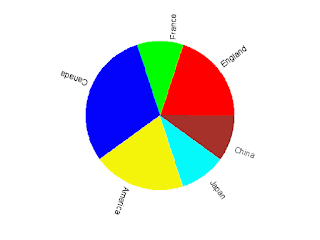
There is no command to create a pie chart in gnuplot. To plot a pie chart we need to play some tricks.
A pie chart is made up of some sectors with different colors. First we come to see how to plot a sector.
Sectors are parts of a sphere symmetrical plane, so it easy to plot a sector in parametric mode using splot command. For example, commands
set term png
set output "sector.png"
set parametric
set urange [0:pi/3]
set vrange [0:1]
set view map
set size square
unset border
unset tics
unset colorbox
splot cos(u)*v,sin(u)*v,1 w pm3d notitle
 |
| Sector plotted using gnuplot |
England    0.2
France    0.1
Canada    0.3
America    0.2
Japan    0.1
China    0.1
import os
import math

def sign(x):
  '''
  Sign function.
  sign(x)=1 when x >=0
  sign(x)=1 when else.
  '''
  if (x>=0):
    return 1
  else:
    return -1

input=file("data.txt","r")    #open data file
plot=file("pie.gnuplot","w")    #open plot script file

#Some plot commands
plotcommand='''
reset
set term png    #terminal and output file
set output "pie.png"
set size square    #square size
set isosample 50,50    #samples
set parametric    #parametric mode on
set xrange [-1:1]    #x,y,v range
set yrange [-1:1]
set vrange [0:1]
unset border    #no border, tics and colorbox
unset xtics
unset ytics
unset colorbox
set view map    #the view point
set palette defined(0 "red",1 "green",2 "blue",\\
    3 "yellow",4 "cyan",5 "brown",6 "greenyellow",\\
    7 "gray",8"bisque",9"violet",10"black")
#The color palette
set cbrange [0:10]
set multiplot    #multiplot mode
'''
plot.write(plotcommand)
#output the commands to plot script file
u_begin=0.
#The begin value of u(dummy variable in parametric plot)
i=0. #The item indicate
while True:
  ##Read data
  data=input.readline()
  if len(data)==0:    #if end of data file, break
    break
  data=data.split()

  ##Caculate some parameters
  u_end=u_begin+float(data[1])    #end value of u
  ang=(u_begin+u_end)*math.pi    #the angle lables will be rotated
  x=math.cos(ang)
  x=x+sign(x)*0.2    #x value of label position
  y=math.sin(ang)
  y=y+sign(y)*0.2    #y value of label position

  ##Output some plot commands
  plot.write("set urange [%f*2*pi:%f*2*pi]\n" \
  %(u_begin,u_end))    #command set the range of variable u
  plot.write('set label %d center "%s" at %f,%f rotate \
  by %f*180/pi\n' %(int(i+1),data[0],x,y,ang))
  #command set the labels
  plot.write("splot cos(u)*v,sin(u)*v,%f w pm3d \
  notitle\n" %i)
  #command plot a sector

  u_begin=u_end    #the next begin value of u
  i=i+1

plot.write("unset multiplot") #plot command

input.close()    #close files
plot.close()

os.system("gnuplot plot.gplt")    #execute the plot script
Run this python script we get a gnuplot script named pie.gnuplot and the following pie chart.
 |
| Fig.1 Pie chart created by gnuplot with assistance of python |

Best blog over gnuplot, is birthday, i am like very
ReplyDeleteTanks
Gnuplot Surprising: Pie Chart In Gnuplot >>>>> Download Now
Delete>>>>> Download Full
Gnuplot Surprising: Pie Chart In Gnuplot >>>>> Download LINK
>>>>> Download Now
Gnuplot Surprising: Pie Chart In Gnuplot >>>>> Download Full
>>>>> Download LINK Pb
Very impressive!
ReplyDeleteHello, I don't know python. I am converting this to a different language. Can you tell me what these two statements are doing? I know it depends on the value of the variables, but I'm unsure what the %(var1,var2) produces. Thanks!
ReplyDelete%(u_begin,u_end)
%(int(i+1),data[0],x,y,ang)
u_begin*2*pi means the begin-angle of a sector, and u_end*2*pi means the end-angle of a sector.
DeleteIn plot.write('set label %d center "%s" at %f,%f rotate by %f*180/pi\n' %(int(i+1),data[0],x,y,ang)), int(i+1) is the indicate of the label, data[0] is the label content, (x,y) is the position of the label, and ang is the degree the label should be rotated.
I hope that I have make the meanings of those value clear!
Yes, thank you! It is working and it is very nice! One problem I am having; do you have any idea why my label rotation does not work? It is either 0 or 90. I have tried may different values for "rotate by", but I get only 0 or 90 rotation. I am using gnuplot 4.6 with Red Hat Enterprise Linux Server release 5.5 (Tikanga). Thank You!
DeleteHere is my script:
set term png
set output "/tmp/proj1/temp6254941099.png"
set size square
set isosample 50,50
set parametric
set xrange [-1:1]
set yrange [-1:1]
set vrange [0:1]
unset border
unset xtics
unset ytics
unset colorbox
set view map
set palette defined(0 "red",1 "green",2 "blue",\
3 "yellow",4 "cyan",5 "brown",6 "greenyellow",\
7 "gray",8"bisque",9"violet",10"black")
set cbrange [0:10]
set multiplot
set urange [0:2.4630085984]
set label 1 center "Charges" at .5328195458499619336,1.142990535424521155 rotate by 70.56
splot cos(u)*v,sin(u)*v,0 w pm3d notitle
set urange [2.4630085984:2.764601488]
set label 2 center "Payments" at -1.063923415688659883,.7036232042160477935 rotate by 149.76
splot cos(u)*v,sin(u)*v,1 w pm3d notitle
set urange [2.764601488:3.2169908224]
set label 3 center "Write Offs" at -1.188651744224520582,.3502255924994577459 rotate by 171.36
splot cos(u)*v,sin(u)*v,2 w pm3d notitle
set urange [3.2169908224:5.7302649024]
set label 4 center "Refunds" at -.4364990019905754847,-1.171631731705722841 rotate by 256.32
splot cos(u)*v,sin(u)*v,3 w pm3d notitle
set urange [5.7302649024:6.2831852]
set label 5 center "Bad Debt" at 1.162027669712629851,-.4729519421203798102 rotate by 344.16
splot cos(u)*v,sin(u)*v,4 w pm3d notitle
unset multiplot
Your script run well on my computer. The labels are rotated correctly. And I use gnuplot4.6 on a windows xp system. So this is a system dependent problem.
DeleteThe official document says the rotate property of label is terminal dependent. If the terminal does not support this property, the text will either be horizontal or vertical.
So try another terminal type. For example,
set term pngcairo enhanced
set output "rotate.png"
set label 1 "rotate" at graph 0.5,0.5 rotate by 45
plot x
set output
And this runs well on my linux system. Hope it also works for you.
Yes, it works with pngcairo. Thanks!
ReplyDeleteGnuplot Surprising: Pie Chart In Gnuplot >>>>> Download Now
ReplyDelete>>>>> Download Full
Gnuplot Surprising: Pie Chart In Gnuplot >>>>> Download LINK
>>>>> Download Now
Gnuplot Surprising: Pie Chart In Gnuplot >>>>> Download Full
>>>>> Download LINK 7y