Thursday, December 22, 2011

Multi-language support of gnuplot --- Using latex (2)

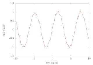
We have shown how to get multi-language support by using latex in the former posts. It works, but a little complicated --- You need to take two steps to get the final graph. In practice, it can be simplified by using an option of the (*)latex terminal. This option is "header". You can put the package use and other commands after this option, and then the generated tex file will contain these information at the header part. So you need not to modify the tex file manually. You get the final graph at one step.

So try the following plot script. Run it and compile the output tex file using latex, and at once you a Chinese supported graph.

reset
set term epslatex color standalone header \
"\\usepackage{CJK}\n \
\\AtBeginDocument{\\begin{CJK*}{GBK}{song}} \
\\AtEndDocument{\\end{CJK*}}"

set output "voltage.tex"

set xlabel "时间(秒)"
set ylabel "电压(伏)"
unset key
plot sin(x)+0.1*(2*rand(0)-1.) w l lw 2
set output 

Gnuplot plotted graph with Chinese support

Thursday, December 15, 2011

gnuplot的多国语言支持----通过latex(1)

非英语用户经常遇到的一个问题就是在图像中插入非英语字符。对新手而言,有时这是一件很具挑战性的工作。该帖子将讨论如何使用latex来解决该问题。

我们知道通过使用合适的宏包latex可以进行多语言排版。我们还知道gnuplot的终端类型中包括诸如latex,epslatex等。所以我们可以先在这些终端类型下绘图,然后通过修改tex文件来获得图像的多国语言支持。下面以中文的支持为例来说明该问题。

首先我们使用下面的脚本来绘图。

reset
set term epslatex color standalone
set output "voltage.tex"
set xlabel "my xlabel"
set ylabel "my ylabel"
unset key
plot sin(x)+0.1*(2*rand(0)-1.) w l lw 2
set output


使用latex编译输出的tex文件,得到如下图片
无中文支持的gnuplot绘图结果

我们希望将x轴标注为“时间(秒)”,y轴标注为“电压(伏)”。为实现该效果,使用任意文本编辑软件打开tex文件,找到如下行

\put(4039,154){\makebox(0,0){\strut{}my xlabel}}%


\put(308,2739){\rotatebox{-270}{\makebox(0,0){\strut{}my ylabel}}}

然后将“my xlabel”替换为“时间(秒)”,将“my ylabel”替换为“电压(伏)”。同时将下面的代码加到文件的头部分来得到latex对中文的支持。

\usepackage{CJK}
\AtBeginDocument{\begin{CJK*}{GBK}{song}}
\AtEndDocument{\end{CJK*}}

此时再次编译tex文件就可以得到中文支持的的图片了。

中文支持的gnuplot绘图结果

修改前和修改后的tex可以通过下面链接下载。

voltage.tex  voltage_chinese.tex

Saturday, December 3, 2011

Multi-language support of gnuplot --- Using latex

For some non-English speakers, inserting some their own characters into the graph is usual. And for some fresh, this some times becomes a challenging task. This posts will talk about how to solve this problem using latex.

We know that some packages used latex can deal with multi-language typesetting. And we also know that gnuplot have terminals like latex, epslatex. So we can first plot a English graph with these terminals, then modify the output tex files, and at last get a multi-language supported graph. Take Chinese support for example.

We first plot a graph using the following script.

reset
set term epslatex color standalone
set output "voltage.tex"
set xlabel "my xlabel"
set ylabel "my ylabel"
unset key
plot sin(x)+0.1*(2*rand(0)-1.) w l lw 2
set output

Compile the output tex file using latex we get a graph like the following one.
Gnuplot plotted graph without Chinese support
And we want to label the x-axes with "时间(秒)"(means time) and y-axes with "电压(伏)"(means voltage). To realize this effect, we open the tex file with any text editor and find lines

\put(4039,154){\makebox(0,0){\strut{}my xlabel}}%

and

\put(308,2739){\rotatebox{-270}{\makebox(0,0){\strut{}my ylabel}}}

Then we repalce "my xlabel" with "时间(秒)", "my ylabel" with "电压(伏)". And add the following codes into the header part of the file to get the chinese support of latex.

\usepackage{CJK}
\AtBeginDocument{\begin{CJK*}{GBK}{song}}
\AtEndDocument{\end{CJK*}}
This time compile the tex file uising latex again. And a chinese supported graph is gotten.
Gnuplot plotted graph with Chinese support
The modified and pre-modified tex files can be downloaded here.
voltage.tex  voltage_chinese.tex

Tuesday, November 22, 2011

How to plot nothing using gnuplot

Some times we just want to create a figure with only the axes ticks and so on, no any content (The content may be added later use some other tools). We know that if there is not a plot command, gnuplot will not create a output picture, So play some tricks should be played. In this post I will talk on two methods to plot nothing using gnuplot.

The first one is plot a line with background color.
reset
set term png font ",20" xffffff  #set png terminal and the background color is white
set output "blank.png"
set key off
set ytics 0.5
plot sin(x) with line linecolor rgb"#ffffff"
set output

The second one is plot something out of yrange.
set term png font ",20"
set output "blank.png"
set yrange [-1:1]
set key off
plot 2 with lines
set output
Maybe some other methods also exist, But this three shold be the most used and simplest ones. At last a sample picture posted. (The two methods will just creat pictures the simillar as this one.)
Plot nothing using gnuplot

Tuesday, November 15, 2011

Aviodding the blank margin of a eps picture being auto croped by some softwares

Some one complained to me that when he inserted a gnuplot produced eps picture into some software (not all) the blank margins are auto cropped. And he want to avoid this to happen.
Yes, I also found this problem myself. Some software "intelligently" crop the blank margin of a postscript picture. Always this is just OK. But in some special cases, we set a blank margin of special purpose, for example, to leave some spaces for readers to add some notes. In these cases, the "intelligence" becomes "stupid".
I solve this problem by adding a invisible rectangle (with linewidth equals 0 or with color same as the background color and fillstyle onborder) as large as the screen, i.e.,
set object rectangle from screen 0,0 to screen 1,1 \
    lw 0 fillstyle noborder behind   
Then although there are blank margins but they are not blank in fact. So when the picture is inserted to other software, the margin will not be auto cropped.

Sunday, October 30, 2011

Add value labels to the top of bars in a bar chart

It is easy to plot a bar chart with gnuplot using plot style boxes or histogram. This time we talk about how to add values labels to the top of bars in a bar chart.

The first coming idea is adding labels manually using command "set label ...". This a method but a poor efficient one. A better one is plot the labels with plot style "labels". And this is the method we will talk about here. A sample script is shown below.
reset
set term png font "Times,18"    #set terminal and output file
set output "bar_labels.png"
set xlabel "x value"    #set x and y label
set ylabel "Frequency"
set xrange [-0.5:4.5]    #set x and y range
set yrange [0:4]
set xtics 0,1,4    #set xtics
set style fill solid    #set plot style
set boxwidth 0.5
unset key    #legend not plotted
plot "bar_data.dat" using 1:2 with boxes,\
     "bar_data.dat" using 1:2:2 with labels
#plot bar chart and the value labels on the bars
In this script, we have used a data file (bar_data.dat) like this one
0    2
1    3
2    3
3    2
4    2

Run the script, we get picture file bar_labels.png like the following one.

Gnuplot bar chart with value labels

If you do not like the position of the labels in the upper picture, you can just change it. For example,
lot "bar_data.dat" using 1:2 with boxes,\
     "bar_data.dat" using 1:($2+0.25):2 with labels
will put the labels 0.25 units higher.

Value labels with a 0.25 units higher position

Wednesday, October 19, 2011

Broken axes graph in gnuplot (3)

To plot a x-axes broken graph with datafile, the two methods described in the last two posts are also suitable. The first method can be applied straightforwardly. And now we come to an example to apply the second method to a datafile plotting.

Consider such a case, an experiment team research on a material's thermodynamical properties. They heat it and record the temperature for 13 hours the first day, then its time for they to go home. And they go on their recording the second day. At last they get a data file like the following one.
0.00    25.76 
1.00   29.91 
2.00   35.33 
3.00   38.85 
4.00   43.15 
5.00   47.35 
6.00   50.45 
7.00   53.55 
8.00   56.12 
9.00   57.31 
10.00  59.11 
11.00  62.21 
12.00  62.17 
13.00  63.05 

23.00  63.56 
24.00  62.98 
25.00  66.05 
26.00  65.88 
27.00  64.70 
28.00  65.37 
29.00  63.12 
30.00  65.66 
31.00  66.14 
32.00  64.92 
33.00  65.68 
34.00  64.01 
35.00  63.50
36.00   63.75
We can find that their is a break when they go home. We will use a broken axes graph to deal with this break.
set term post eps enhanced
set output "broken_axes3.png"
set xrange [0:36-10+0.5]
set yrange [25:70]
set border 2+8
set arrow 1 from 0,25 to 13,25 nohead
set arrow 2 from 13.5,25 to 26.5,25 nohead
set arrow 3 from 0,70 to 13,70 nohead
set arrow 4 from 13.5,70 to 26.5,70 nohead

set arrow 5 from 12.75,24 to 13.25,26 nohead
set arrow 6 from 13.25,24 to 13.75,26 nohead
set arrow 7 from 12.75,69 to 13.25,71 nohead
set arrow 8 from 13.25,69 to 13.75,71 nohead

set xtics ("0" 0, "4" 4, "8" 8, "12" 12,\
           "24" 14.5, "28" 18.5, "32" 22.5, "36" 26.5)
set xlabel "Time:t(h)"
set ylabel "Temperature:T({/Symbol \260}C)"
plot "data.dat" u ($1<13. ?$1: $1>13. ?($1-9.5):1/0):2 w lp lw 2 ps 2 notitle
In this script the key point is "u ($1<13 ?$1: $1>13 ?($1-9.5):1/0):2" which transform range [23:36] to range [13.5:26.5] and let range [0:13] uneffected. The followng piture is broken_axes3.png (This png file is converted from broken_axes.eps).

Broken x-axes graph plotted using gnuplot

Sunday, October 16, 2011

Broken axes graph in gnuplot (2)

Last time I said there is a "better but a little tricky" method to plot a broken axes graph. And now let us come to see this method.

If we want to plot function f(x) in range of [a:b] and [c:d] (i.e., a broken axes graph), we can define a new function:
g(x) = f(x)                         a<= x <= b
g(x) = f(x+c-b-dx)              b+dx <= x <= b+dx-c+d
g(x) = 1/0                         other x
where dx is the gap length. We plot this new function and modify xtics to a right one. Then we get a broken x-axes graph which will similar to the one we plotted last time. Let us start work our idea out.
reset
set term png
set output "broken_axes2.png"
#Plot f(x)=sin(x**2/4.) at range [20:22] and [40:42]
f(x)=sin(x**2/4.)
g(x)=20<x && x<22 ?f(x) :22<x && x<22.2 ?1/0 :22.2<x && x<24.2 ?f(x+17.8) :1/0
set xrange [20:24.2]
set yrange [-1:1]
set sample 2000
set border 2+8  #the bottom and top border will be plotted mannually
set arrow 1 from 20,-1 to 22,-1 nohead              #bottom and top border
set arrow 2 from 22.2,-1 to 24.2,-1 nohead
set arrow 3 from 20,1 to 22,1 nohead
set arrow 4 from 22.2,1 to 24.2,1 nohead
set arrow 5 from 21.95,-1.05 to 22.05,-0.95 nohead  #axes broken indication line
set arrow 6 from 22.15,-1.05 to 22.25,-0.95 nohead
set arrow 7 from 21.95,0.95 to 22.05,1.05 nohead
set arrow 8 from 22.15,0.95 to 22.25,1.05 nohead
#Modify xtics to a right value
set xtics ("20" 20,"20.5" 20.5,"21" 21,"21.5" 21.5,"22" 22,\
           "40" 22.2,"40.5" 22.7,"41" 23.2,"41.5" 23.7,"42"24.2)
set xlabel "Time:t(s)"
set ylabel "Signal:U(V)"
plot g(x) w l lw 2 notitle
The picture file broken_axes2.png is shown below.

Broken axes graph plotted by gnuplot

Next time I will put this method to the datafile case.

Thursday, October 6, 2011

Broken axes graph in gnuplot (1)

If the range of data is large, it is not convenient to plot the whole range. Then broken axes graph is introduced. Let us see a broken axes graph at first and then how it is plotted.


To plot a broken axes graph like the upper one, there are two methods. We first introduce the one which is simple to understand and a better but a little tricky one will be talked next time. This method uses the "multiplot" mode, plotting the left and right part of the broken axes graph separately. Let us come to see our script. This script just produce the former graph. The explaination of the script is covered as comments of the script and will not be given separately.

reset
set term png font "Times,15"
set output "broken_axes1.png"
f(x)=exp(-x)*sin(500*x)     #plotting function
set yrange [-1:1]    #The later two plot have same yrange
set sample 400
set tics nomirror
set tmargin at screen 0.9   #the later two plots will share this tmargin
set bmargin at screen 0.1   #------------------------------------b------

set multiplot    #begin multiplot mode

#axes broken line
set arrow 1  from screen 0.5,0.08 to screen 0.52,0.12 nohead
set arrow 2  from screen 0.52,0.08 to screen 0.54,0.12 nohead
set arrow 3  from screen 0.5,0.88 to screen 0.52,0.92 nohead
set arrow 4  from screen 0.52,0.88 to screen 0.54,0.92 nohead

#x,y axis label and title label
set label 1 "Time: t(s)" at screen 0.475,0.025
set label 2 "Signal:U(mV)" at screen 0.025,0.44 rotate by 90
set label 3 center "U=exp(-t)sin(500t)" at screen 0.5,0.95

#The left part
set border 1+2+4    #the right border is not plotted
set lmargin at screen 0.1   #the left-part's location
set rmargin at screen 0.51
set xtics 0,0.02,0.08
plot [0:0.1] f(x) w l lt 1 lw 2 notitle

#unset the labels and arrows, otherwise they will be plot 
#for the second time
unset label 1
unset label 2
unset label 3 

unset arrow 1
unset arrow 2
unset arrow 3
unset arrow 4

#the right part
set border 1+4+8    #the left border is not plotted
set lmargin at screen 0.53      #the right-part's location
set rmargin at screen 0.94
#ytics is not plotted, as the second plot will share it with the first one
unset ytics
set xtics 0.9,0.02,1.0
plot [0.9:1] f(x) w l lt 1 lw 2

unset multiplot

Monday, October 3, 2011

Round corner key box in gnuplot

In a previous post I talked about create a round corner rectangle in gnuplot. But none application was involved in that post. Today I use the method to create a round corner key box.
###############################################
#Variables:
##(a,b) is the low left vertex of the rectangle
##(c,d) is the up right vertex of the rectangle
##rx is the radius along x-axis
##ry is the radius along y-axis
##x is the independent variable of the curve
f_low(a,b,c,d,rx,ry,x)=a<x && x<a+rx ? \
     -ry*sqrt(1-((x-a-rx)/rx)**2)+b+ry : \
     a+rx<x && x<c-rx ? b :c-rx<x && x<c ?\
     -ry*sqrt(1-((x-c+rx)/rx)**2)+b+ry : 1/0
#The low curve of a round corner rectangle
f_up(a,b,c,d,rx,ry,x)=a<x && x<a+rx ?\
     ry*sqrt(1-((x-a-rx)/rx)**2)+d-ry : \
     a+rx<x && x<c-rx ? d :c-rx<x && x<c ?\
     ry*sqrt(1-((x-c+rx)/rx)**2)+d-ry : 1/0
#The up curve of a round corner rectangle
###############################################
reset
set term png font "Times,18"    #terminal and output file
set output "round_corner_rectangle_key_box.png"
set tics out nomirror
unset key    #key will be created manually
set sample 1000    #samples
#Setting the back ground color
set object 1 rect from graph 0,0 to graph 1,1 back
set object 1 rect fc rgb "#AAAAFF" fillstyle solid 1.0
#The text of the key (some people call it legend)
set label center "y=f(x)" at 5.75,0.7 front
#x and y label
set xlabel "x"
set ylabel "y=f(x)"
#Plot the curve,round corner rectangle and sample line of key
plot sin(5.*x)*exp(-x*x/20.) w l lw 2 lc rgb"green",\
     '+' u 1:(f_low(3.5,0.5,9,0.9,0.5,0.05,$1)):\
     (f_up(3.5,0.5,9,0.9,0.5,0.05,$1)) w filledcurve\
     lc rgb"pink" notitle,\
     x>7.5 && x<8.5 ?0.7:1/0 w l lw 2 lc rgb"green"
Nothing new in this script. The only important and difficult thing is deciding the position of the key text, key sample line and key box. At last we get a picture like this one.

Round corner key box in gnuplot


Sunday, October 2, 2011

Pie chart in gnuplot

Although it is advised that use pie chart as less as possible. Some times a pie chart can clearly show the percentage of some component and it is useful. So I will talk about how to make a pie chart in gnuplot.

There is no command to create a pie chart in gnuplot. To plot a pie chart we need to play some tricks.

A pie chart is made up of some sectors with different colors. First we come to see how to plot a sector.

Sectors are parts of a sphere symmetrical plane, so it easy to plot a sector in parametric mode using splot command. For example, commands
set term png
set output "sector.png"
set parametric
set urange [0:pi/3]
set vrange [0:1]
set view map
set size square
unset border
unset tics
unset colorbox
splot cos(u)*v,sin(u)*v,1 w pm3d notitle
create a sector like follows.

Sector plotted using gnuplot
Since we have solved the problem of drawing a sector, now we come to make some sectors to form a pie chart. The following is a file describing the income percentage in diffrent country of a company, we would like to plot it to a pie chart.
England    0.2
France    0.1
Canada    0.3
America    0.2
Japan    0.1
China    0.1
The begining and ending angles of a sector is controled by the urange, but it is not convinient to set the urange dynamically in gnuplot. So we will use python to do some assistant work. Our python script is shown below.
import os
import math

def sign(x):
  '''
  Sign function.
  sign(x)=1 when x >=0
  sign(x)=1 when else.
  '''
  if (x>=0):
    return 1
  else:
    return -1

input=file("data.txt","r")    #open data file
plot=file("pie.gnuplot","w")    #open plot script file

#Some plot commands
plotcommand='''
reset
set term png    #terminal and output file
set output "pie.png"
set size square    #square size
set isosample 50,50    #samples
set parametric    #parametric mode on
set xrange [-1:1]    #x,y,v range
set yrange [-1:1]
set vrange [0:1]
unset border    #no border, tics and colorbox
unset xtics
unset ytics
unset colorbox
set view map    #the view point
set palette defined(0 "red",1 "green",2 "blue",\\
    3 "yellow",4 "cyan",5 "brown",6 "greenyellow",\\
    7 "gray",8"bisque",9"violet",10"black")
#The color palette
set cbrange [0:10]
set multiplot    #multiplot mode
'''
plot.write(plotcommand)
#output the commands to plot script file
u_begin=0.
#The begin value of u(dummy variable in parametric plot)
i=0. #The item indicate
while True:
  ##Read data
  data=input.readline()
  if len(data)==0:    #if end of data file, break
    break
  data=data.split()

  ##Caculate some parameters
  u_end=u_begin+float(data[1])    #end value of u
  ang=(u_begin+u_end)*math.pi    #the angle lables will be rotated
  x=math.cos(ang)
  x=x+sign(x)*0.2    #x value of label position
  y=math.sin(ang)
  y=y+sign(y)*0.2    #y value of label position

  ##Output some plot commands
  plot.write("set urange [%f*2*pi:%f*2*pi]\n" \
  %(u_begin,u_end))    #command set the range of variable u
  plot.write('set label %d center "%s" at %f,%f rotate \
  by %f*180/pi\n' %(int(i+1),data[0],x,y,ang))
  #command set the labels
  plot.write("splot cos(u)*v,sin(u)*v,%f w pm3d \
  notitle\n" %i)
  #command plot a sector

  u_begin=u_end    #the next begin value of u
  i=i+1

plot.write("unset multiplot") #plot command

input.close()    #close files
plot.close()

os.system("gnuplot plot.gplt")    #execute the plot script
Note that although we use a python script, the plot is done by gnuplot. Python is used only to create the gnuplot plot script, i.e., to do some text work.

Run this python script we get a gnuplot script named pie.gnuplot and the following pie chart.
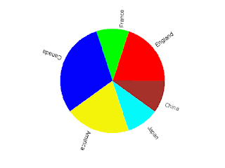
Fig.1 Pie chart created by gnuplot with assistance of python

Posts Plot a pie chart using gnuplot and Pie charting using gnuplot give new solutions of pie chart plotting and anyone interested in can take for a reference.

Saturday, October 1, 2011

Round corner rectangle in gnuplot

A simple rectangle always looks too hard while a round corner rectangle looks more comfortable. In this article I will talk about how to create an round corner rectangle in gnuplot.

There is rectangle object in gnuplot, but unfortunately there seems no option to set it a round corner one. So an absolutely new method will be used. I will use plot style "filledcurve" to create an round corner rectangle. Now come to the script.
###############################################
#Variables:
##(a,b) is the low left vertex of the rectangle
##(c,d) is the up right vertex of the rectangle
##rx is the radius along x-axis
##ry is the radius along y-axis
##x is the independent variable of the curve
f_low(a,b,c,d,rx,ry,x)=a<x && x<a+rx ? \
     -ry*sqrt(1-((x-a-rx)/rx)**2)+b+ry : \
     a+rx<x && x<c-rx ? b :c-rx<x && x<c ?\
     -ry*sqrt(1-((x-c+rx)/rx)**2)+b+ry : 1/0
#The low curve of a round corner rectangle
f_up(a,b,c,d,rx,ry,x)=a<x && x<a+rx ?\
     ry*sqrt(1-((x-a-rx)/rx)**2)+d-ry : \
     a+rx<x && x<c-rx ? d :c-rx<x && x<c ?\
     ry*sqrt(1-((x-c+rx)/rx)**2)+d-ry : 1/0
#The up curve of a round corner rectangle
###############################################
unset border    #no border
unset tics    #no tics
set sample 1000
set xrange [-10:10]
set yrange [-10:10]
set term png
set output "round_corner_rectangle.png"
plot '+' u 1:(f_low(-10,-10,10,10,1,2,$1)):\
     (f_up(-10,-10,10,10,1,2,$1)) w filledcurve\
     lc rgb"pink" notitle
#plot a round corner rectangle 
Load the plotting script, and we get picture file found_corner_rectangle.png like this.
Round corner rectangle created using filledcurve plot style in gunplot

Friday, September 30, 2011

Rotate a picture using gnuplot

Last time I promised rotating a picture using gnuplot will be talked. Today I come to realize my promise.Let us look at the script at first.
#Utility:Convert a rgb colorized image to a gray one
#Author:数声风笛离亭晚,我想潇湘君想秦!
#Email:qinjieli@gmail.com
#Usage:
##call "rotate.gnuplot" angle inputfile outputfile
#parameters:
##angle: the angle to be rotated
##inputfile: input filename (without ".png")
##outputfile: outputfilename (without ".png")
reset
angle=$0    #angle to be rotated
angle=angle*pi/180    #change degrees to radians
inputfile="$1.png"    #input file
outputfile="$2.png"    #ouput file
set size ratio -1
# Set the scales so that the unit has the same length
#on both the x and y axes
set lmargin 0    #nO margin
set rmargin 0
set tmargin 0
set bmargin 0
unset tics    #no tics and border line
unset border
#plot and get the size of the rotated picture
plot inputfile binary filetype=png rotate=angle w rgbima notitle
xmax=GPVAL_DATA_X_MAX
xmin=GPVAL_DATA_X_MIN
ymin=GPVAL_DATA_Y_MIN
ymax=GPVAL_DATA_Y_MAX
set xrange [xmin:xmax]    #set x and y range
set yrange [ymin:ymax]
set term png truecolor size (xmax-xmin),(ymax-ymin)    #set the terminal
set output outputfile
plot inputfile binary filetype=png rotate=angle w rgbima notitle
The script first plot the plot the rotated picture on screen. This plot has two functions, determining the size of the output picture and letting the user have view at the rotated picture. Save the script as "rotate.gnuplot", and then it can be called like this:
gnuplot> call "rotate.gnuplot" 30 input output
At last is one of our finished work.

Input picture file (initial file download from here)

Picture rotated by 30 degree using our script


Thursday, September 29, 2011

Crop picture using gnuplot

We talked about converting a rgb image to a gray one using gnuplot last time. Except this, Gnuplot also can do some other manipulations such as cropping, rotating and so on. In this article and next few ones I will talk about them respectively. This time we deal with cropping.

Cropping is selecting specific area from the picture, then drawing it to an output file. In gnuplot this can be done by setting the xrange and yrnage to a proper value and then plot. The script is shown below.
#Utility: crop png pictures using gnuplot.
#Author:数声风笛离亭晚,我想潇湘君想秦!
#Email:qinjieli@gmail.com
#Usage:
##call "crop.gnuplot" x1 y1 x2 y2 inputfile outputfile
#parameters:
##x1: x-value of left-bottom point
##y1: y-value of left-bottom point
##x2: x-value of right-top point
##y2: y-value of right-top point
##inputfile: input filename (without ".png")
##outputfile: output filename (without ".png")
reset
x1="$0"   #The left bottom point
y1="$1"
x2="$2"   #The right top point
y2="$3"
inputfile="$4.png"    #inputfile name
outputfile="$5.png"   #outputfile name
set xrange [x1:x2]
set yrange [y1:y2]
set size ratio -1
# Set the scales so that the unit has the same length
#on both the x and y axes
#There shold be no margin
set lmargin 0
set rmargin 0
set tmargin 0
set bmargin 0
#There shold be no key tics and border
unset key
unset tics
unset border
set term png truecolor size (x2-x1),(y2-y1)
set output outputfile
plot inputfile binary filetype=png w rgbimage
Save this script as "crop.gnuplot". Then it can be called from gnuplot like this:
gnuplot> call "crop.gnuplot" x1 y1 x2 y2 inputfile outputfile
In the end as usual let me show a finished work.

Input picture file (initial file download from here)

Picture cropped using command "call "plot.gplt" 250 150 500 400 input output"

Tuesday, September 27, 2011

Convert a rgb colorized png picture to a gray one using gnuplot

I will talk about convert a colorized rgb image to a gray one using gnuplot in this article.
Amazing it is to edit pictures with gnuplot. Yes, it is a little amazing, this kind of works should left to picture editors in fact. But I will show you gnuplot can also do it well.
In a rgb image, the color of a point is marked with (r,g,b) where r,g and b can be and always are diffrent values. While for a gray one r,g and b must be the same. So to convert a rgb image to a gray one, we should convert (r,g,b) to (gray,gray,gray). Once we known how to do it, the problem becomes easy. Now we come to write our gnuplot script.
#Utility:Convert a rgb colorized image to a gray one
#Author:数声风笛离亭晚,我想潇湘君想秦!
#Email:qinjieli@gmail.com
#Usage:
##call "rgbtogray.gnuplot" inputfile outputfile
#parameters:
##inputfile: input filename (without ".png")
##outputfile: outputfilename (without ".png")
reset
inputfile="$0.png"
outputfile="$1.png"
plot inputfile binary filetype=png w rgbimage
xmax=GPVAL_DATA_X_MAX
xmin=GPVAL_DATA_X_MIN
ymin=GPVAL_DATA_Y_MIN
ymax=GPVAL_DATA_Y_MAX
set xrange [xmin:xmax]
set yrange [ymin:ymax]
#get the size of the picture
gray(r,g,b)=0.299*r + 0.587*g + 0.114*b
#The function which convert rgb color to gray.
#At first I choose the three weighting all to be 0.333,
#but a firend told me it will be better to use these values
set size ratio -1
# Set the scales so that the unit has the same length
#on both the x and y axes
#########################
#There should not be any margin in the output picture
set lmargin 0
set rmargin 0
set tmargin 0
set bmargin 0
unset key   #The key, border and tics are all do not need
unset border
unset tics
#set terminal and output file name
set term png size (xmax-xmin),(ymax-ymin)
set output outputfile
#Plot with gray color
plot inputfile\
     u (gray(column(1),column(2),column(3))):\
       (gray(column(1),column(2),column(3))):\
       (gray(column(1),column(2),column(3)))\
     binary filetype=png w rgbimage
Save the script as "rgbtogray.gnuplot", then it can be called like this:
gnuplot> call "rgbtogray.gnuplot" inputfile outputfile
The following is two groups of our input and ouput files. The initial input files are copied from here and here (Thanks the original picture author!).
 

Input file-1

Output file-1

Input file-2

Output file-2

Saturday, September 24, 2011

Implicit function plotting using gnuplot

Assume three is an equation f(x,y)=g(x,y), and we want to plot the roots which obey this equation. This is a typical implicit function plotting problem. How do we handle this problem using gnuplot?

The most simple idea is solving the equation analytically (or numerically), and get the the root y=h(x) (or a data file containing the roots). Then plot h(x) (or the data file) with gnuplot. Of course, it is OK. But here we provide a more simpler method.

Note that the contour line at level 0 for function z=f(x,y)-g(x,y) is just the lines made up by the points which obey equation f(x,y)=g(x,y). So we can convert implicit function plotting problem to a contour plotting problem. Now come to a example.
reset
set term png enhanced lw 2 font "Times,18"
set output "implicit.png"
set contour
set cntrparam levels discrete 0
set view map
unset surface
set nokey
set isosamples 1000,1000
set xrange [-2:2]
set yrange [-2:2]
set xlabel "x"
set ylabel "y"
set title "Implicit plot of sin(x^2+y^2)=exp(-xy)"
splot sin(x**2+y**2)-exp(-x*y)
Picture implicit.png is as follows.

Implicit Plot Using Gnuplot

Thursday, September 22, 2011

Creating gif animation using gnuplot

Now the new version of gnuplot(gnuplot4.6) makes things much easier, you can refer to another of my posts for the new way.

Some times an animation makes thing much easier to be understood. When I was in middle school, I can not understand the propagation of wave well although the teacher took great effort to explain it to me. At last he show me an animation of propagating wave, at the instance i understand it. So can gnuplot create such a powerful thing? The answer is yes. Under gif terminal, if the animate option is selected, Gnuplot will thought each plot as a frame of an animation. Next is an example.
#We will plot sin(x+t) in this gif animation
reset
set term gif animate
set output "animate.gif"
n=24    #n frames
dt=2*pi/n
set xrange [0:4*pi]
i=0
load "animate.gnuplot"
set output
where file animate.gnuplot contain the following gnuplot commands:
plot sin(x+i*dt) w l lt 1 lw 1.5 title sprintf("t=%i",i)
i=i+1
if (i < n) reread
Note you can not use "plot for ..." to create an animation, because gnuplot will look it as a single plot and will only create a single frame. Run the script we get an animation as this.


Tuesday, September 20, 2011

Gnuplot I/O: Use fit command to scanf data from files

We usually record our data as follows:
x0         y0
x0+dx      y1
x0+2*dx    y2
...
In fact there is so much redundancy. For the first column we only need to record two numbers x0 and dx. So in a compact format the data can be stored as:
x0
dx
y0
y1
y2
...
Some one may say "these days the memory is so cheap, I do not care the bytes". But have you consider the speed? When you come to process the data, the larger the data file is, the longer time will your program takes. So this new format is worthy.

But problems raised when you want to plot the data file using gnuplot. The software do not recognize this new format. So the task of this article is making gnuplot understand this format.

Firstly we need to read x0 and dx out form the file. As for gnupot there is no functions like scanf in c programming language, we need to play a trick here. We use command fit to read the data out. We known that if there is only two point, the fitting result using function f(x)=a*x+b will be exact. So we use command
fit f(x) "my_format.dat" u 0:1 every ::0::1 via a,b
to fit the first two points. Then we get x0=f(0), dx=f(1). Now the xvalue can be generated by x0+$0*dx. As the xvalue has been prepared, we can come to plot the data file. Now Let me show an example. The plotting script reads:
reset
set term png font "Times,18"
set output "my_format.png"
f(x)=a*x+b
fit f(x) "my_format.dat" u 0:1 every ::0::1 via a,b
x0=f(0)
dx=f(1)
set xlabel "Time(ms)"
set ylabel "Light Intensity(Arbitary Unit)"
set mxtics 5
set mytics 2
set grid xtics mxtics ytics mytics
set offset 0,0,0.05,0
plot "my_format.dat" u (x0+$0*dx):1 every ::2 with lines linewidth 2 notitle
Data file my_format.dat can be downloaded here. And the graph is shown below.

Sunday, September 18, 2011

transparency in gnuplot

There is options to set the fill color in gnuplot to be transparent. But some friends of mine ofen complained that it never works. This is because to let the transparency really work, you also need to choose a transparency supported terminal type. For raster graphics "png" may be a choice, and for vector graphics it may be "pdf". You can use command "help transparent" to see the details.
There is an example.
reset
f(v,T)=4/sqrt(pi*T**3)*exp(-v**2/T)*v**2
set sample 500
set title "Maxwell speed distribution"
set xlabel "Speed [(2kT_c/m)^{1/2}]"
set ylabel "Probability Intensity f(v)"
set style fill transparent solid 0.5
set key Left
set term png truecolor enhanced font "Times,15"
set output "maxwell_speed_distribution.png"
plot [0:5] f(x,0.1) w filledcurves x1 title "T=0.1T_c",\
           f(x,1)   w filledcurves x1 title "T=T_c",\
           f(x,5)   w filledcurves x1 title "T=5T_c"
set term pdf enhanced
set output "maxwell_speed_distribution.pdf"
replot
Note that when transparency is used in png terminal, the "truecolor" option must be selected.

The png file is shown below and the pdf file can be downloaded here.

Saturday, September 17, 2011

Plot histograms using boxes

Some one may ask:"There is histogram plot style in gnuplot, why plot it with boxes?" I would like to say there is some restriction on the built in histogram plot style, for example the x-axis is always using the row number, you can not make it using the coloumns in the data file.

The simplest case is that there is only one group of data to be plotted. In this case you just set the boxwidth to a proper value, for example 0.95, and plot it with boxes. Here is an example.
The data file is like this:
1975    0.5     9.0
1980    2.0     12.0
1985    2.5     10.1
1990    2.6     9.1
1995    2.0     7.2
2000    5.0     8.0
2005    10.2    6.0
2010    15.1    6.2
The plotting script is like this:
reset
set term png truecolor
set output "profit.png"
set xlabel "Year"
set ylabel "Profit(Million Dollars)"
set grid
set boxwidth 0.95 relative
set style fill transparent solid 0.5 noborder
plot "profit.dat" u 1:2 w boxes lc rgb"green" notitle
This example plot a graph like this one:

Plot histogram using boxes with one group of data

When there is more than one group of data to plot, the boxwidth and gap between the boxes should be calculated carefully. We do it like this:
reset
dx=5.
n=2
total_box_width_relative=0.75
gap_width_relative=0.1
d_width=(gap_width_relative+total_box_width_relative)*dx/2.
reset
set term png truecolor
set output "profit.png"
set xlabel "Year"
set ylabel "Profit(Million Dollars)"
set grid
set boxwidth total_box_width_relative/n relative
set style fill transparent solid 0.5 noborder
plot "profit.dat" u 1:2 w boxes lc rgb"green" notitle,\
     "profit.dat" u ($1+d_width):3 w boxes lc rgb"red" notitle
This time we get a histogram with two group of data like this:

Plot histogram using boxes with more than one group of data

Friday, September 16, 2011

Statistic analysis using gnuplot (1)

Last time we dealt with the maximum, minimum and mean value of a statistic analysis problem. Today the standard deviation will be added.
The standard deviation is defined as the square root of the variance. With variance stand for the mean squared value minus the squared mean value. The mean value have been dealt last time. We just need to store it. Strange it is, although there is only one data point after the smooth, when I plot it to a data file using the table mode, I get two output points with the second one marked with "u" which means undefined value.(who can tell me why?) In a similar way we plot the mean of squared value to another data file. Next we read this two value out from the data file. And use them to calculate the standard deviation. Since there is only two data points in the file, we use f(x)=ax+b to fit the data, and the fitted result will be exact, then we can use f(x) to get these exact values. At last we plot the standard deviation on the graph. The following is our final plotting script.
reset
plot "rand_t.dat" u 1:2	#To get the max and min value
ymax=GPVAL_DATA_Y_MAX
ymin=GPVAL_DATA_Y_MIN
ylen=ymax-ymin
xmax=GPVAL_DATA_X_MAX
xmin=GPVAL_DATA_X_MIN
xlen=xmax-xmin
set table "mean.txt"	#put the mean value out
plot "rand_t.dat" u ((xmax+xmin)/2.0):($2) smooth unique w p
unset table
set table "mean_squared.txt"	#put the mean of squared value out
plot "rand_t.dat" u ((xmax+xmin)/2.0):($2**2) smooth unique w p
unset table
f(x)=a*x+b	#The fit functions
g(x)=c*x+d
fit f(x) "mean.txt" u 0:2 via a,b	#Read the mean and mean of squared value
fit g(x) "mean_squared.txt" u 0:2 via c,d
mean=f(0)	#mean value
mean_squared=g(0)	#mean of the squared value
standard_deviation=sqrt(mean_squared-mean**2)	#standard deviation
print "The mean value is ",mean		#print the mean and standard deviation
print "The standard deviation is ",standard_deviation
#plot
set term post eps enhanced color lw 1.5 font ",20"
set output "statistic.eps"
set xrange [xmin:xmax]
set yrange [ymin-0.5*ylen:ymax+0.5*ylen]
set xlabel "time"
set ylabel "Random Signal"
#The labels
set label 1 at (xmin+xmax)/2.,ymax "Maximum" offset 0,0.5
set label 2 at (xmin+xmax)/2.,ymin "Minimum" offset 0,-0.5
set label 3 at (xmin+xmax)/2.,mean "Mean" offset 0,0.5
set label 4 at (xmin+xmax)/2.,mean+3*standard_deviation \
             "Mean+3{/Symbol \163}" offset 0,0.5
set label 5 at (xmin+xmax)/2.,mean-3*standard_deviation \
             "Mean-3{/Symbol \163}" offset 0,-0.5
plot "rand_t.dat" u 1:2 w p pt 7 ps 0.5 notitle,\
     mean w l lt 2 notitle "Mean",\
     ymax w l lt 3 notitle "Maximum",\
     ymin w l lt 3 notitle,\
     mean+3*standard_deviation w l lt 4 notitle,\
     mean-3*standard_deviation w l lt 4 notitle
#the six plot stand for raw data, mean, maximum, minimum,
#3-sigma upper line and 3-sigma lower line
At last we get figure like follows.

Statistic analysis using gnuplot

Wednesday, September 14, 2011

Statistic analysis using gnuplot (0)

I will talk about statistic analysis using gnuplot in this article. The following contents are covered---maximum, minimum, mean value, standard deviation.

We begin with the maximum and minimum as they are the simplest. There are two gnuplot defined variables (to see all the gnuplot variables use command "show variable all"), GPVAL_DATA_Y_MAX and GPVAL_DATA_Y_MIN. They are the maximum and minmum y value in the data file which you just used to plot. So after plotting you look over the gnuplot defined variables and you find the maximum and minimum values.

The mean value is a bit difficult. There is no such a gnuplot defined value. To find it out we will play a trick. There is smooth option called "unique" which makes the data monotonic in x and points with the same x-value are replaced by a single point having the average y-value. So it is appropriate for finding the mean value. We use command
plot "data_t.dat" u (constant-value):($n) smooth unique w point
to plot the mean value. Here constant-value is an arbitrary constant and $n is the column which contains the random data. Note that there is only one point plotted using the above command, so plot style line can not be used. To plot the the mean value using a line we may need to use xerrobars plot style. (Next time I will give a method to plot it using plot style line.)
plot "data_t.dat" u (constant-value):($n):(xerrobar-length) smooth unique w xerrorbars

Now we come to plot the data points, maximum, minimum and mean value to a picture. And standard deviation is left next time.
reset
plot "rand_t.dat" u 1:2	#To get the max and min value
ymax=GPVAL_DATA_Y_MAX
ymin=GPVAL_DATA_Y_MIN
ylen=ymax-ymin
xmax=GPVAL_DATA_X_MAX
xmin=GPVAL_DATA_X_MIN
xlen=xmax-xmin
#plot
set term png
set output "statistic.png"
set xrange [xmin:xmax]
set yrange [ymin-0.5*ylen:ymax+0.5*ylen]
set xlabel "time(ms)"
set ylabel "Random Signal(Arbitary Unit)"
plot "rand_t.dat" u 1:2 w p pt 7 ps 0.5 notitle,\
     "rand_t.dat" u (xmax+0.1*xlen):($2):(1.1*xlen)\
     smooth unique w xerrorbars notitle,\
     ymax w l lt 3 notitle,\
     ymin w l lt 3 notitle
#plot raw data, mean value, maximun and minimun respectively
#There is only one data point for the mean value. To make it 
#looks like a line, we plot it using a xerrorbars plot style.
rand_t.dat can be downloaded here. Picture statistic.png is shown below.
Statistic analysis using gnuplot--maximum,minimum and mean value

Sunday, September 11, 2011

Statistic analysis and histogram plotting using gnuplot

Given a data file containing a set of data, count how many datas locate in intervals [a1:a2],[a2:a3]... respectively, then plot the result into a histogram. This a common problem in statistics and exactly what we will do in this article.

Firstly, let us see how to map the data into intervals. There is a function "floor(x)" which return the largest integer not greater than its argument. So function floor(x/dx)*dx will map x into one of the intervals [-n*dx:-(n-1)*dx],[-(n-1)*dx:-(n-2)*dx]...[(n-1)*dx:n*dx].

Now we come to count the data number in each interval. In gnuplot there is a smooth option called "frequency". It makes the data monotonic in x. Points with the same x-value are replaced by a single point having the summed y-values. Using this property, we can count the data numbers in the intervals.

At last we plot our result using boxes plot style.

The main idea have introduced. It is time to write the plotting script.
reset
n=100 #number of intervals
max=3. #max value
min=-3. #min value
width=(max-min)/n #interval width
#function used to map a value to the intervals
hist(x,width)=width*floor(x/width)+width/2.0
set term png #output terminal and file
set output "histogram.png"
set xrange [min:max]
set yrange [0:]
#to put an empty boundary around the
#data inside an autoscaled graph.
set offset graph 0.05,0.05,0.05,0.0
set xtics min,(max-min)/5,max
set boxwidth width*0.9
set style fill solid 0.5 #fillstyle
set tics out nomirror
set xlabel "x"
set ylabel "Frequency"
#count and plot
plot "data.dat" u (hist($1,width)):(1.0) smooth freq w boxes lc rgb"green" notitle
We use a data file (download from here) which contains 10000 normally distributed random numbers and get a graph like the follow one.

statistic histogram plotting using gnuplot

Friday, September 9, 2011

Manipulate data using ternary operator in gunplot

In gnuplot there is an operator "? :" which is ternary. It behaves as it does in C language. For example, "a?b:c" means if a is true then return 'b', otherwise return 'c'. Using this operator we can do some complex operation on input data. Let us see an example.

We have a data file as follows:
#x  y1   y2
0.1	0.2	0.2
0.2	0.4	0.4
0.3	0.6	0.6
0.4	0.8	0.8
0.5	1	1
0.6	1.2	1.2
0.7	1.4	1.4
0.8	2.4	0.6
0.9	2.7	0.675
1	3	0.75
1.1	3.3	0.825
1.2	3.6	0.9
1.3	3.9	0.975
1.4	4.2	1.05
1.5	4.5	1.125
We want to plot the points y1=y2 with blue pints, and other points y1!=y2 (y1 not equals y2) with some other colors. To realize this goal, we can use ternary operator. According to the definition of ternary operator, expression "$2==$3?$2:1/0" will return the points satisfy $2=$3, and when $2!=$3 it returns undefied value(1/0 is an undefied value). So when we use command "plot 'data.dat' u 1:($2==$3?$2:1/0) w p", we plot the points with y1=y2. In a simillar manner, we can plot the points with y1!=y2. Now we come to our final plotting script.
reset
set term png font "Times,20"
set output "ternaty.png"
set xlabel "x"
set ylabel "y"
plot "data.dat" u 1:($2==$3?$2:1/0) w p lc rgb"blue" notitle,\
     "data.dat" u 1:($2!=$3?$2:1/0) w p lc rgb"green" notitle,\
     "data.dat" u 1:($2!=$3?$3:1/0) w p lc rgb"red" notitle
The picture comes out to be like follows.

Manipulate data using ternary operator in gnuplot

Gradient colored curve in Gnuplot(2)

In the previous article we plot a gradient colored curve by expanding it to a 3-d surface and view the surface in a particular viewpoint. Today we talk about a third method.

In gnuplot we can specify the plotting colors by "rgbcolor variable". It can assign a separate color for each data point,line segment,or label based on additional information in the input data file. For example "plot 'data.dat' u 1:2:3 with points lc rgb variable" will plot each data point with separate color according to the third column of the data file. Now we come to plot the following data file using "rgbcolor variable".
0.0 	0.00 
0.2 	0.14 
0.4 	0.56 
0.6 	1.25 
0.8 	2.12 
1.0 	3.00 
1.2 	3.65 
1.4 	3.90 
1.6 	3.79 
1.8 	3.64 
2.0 	4.00 
2.2 	5.40 
2.4 	8.10 
2.6 	11.84 
2.8 	15.84 
3.0 	19.00 
3.2 	20.41 
3.4 	19.78 
3.6 	17.78 
3.8 	15.91 
4.0 	16.00 
4.2 	19.42 
4.4 	26.39 
4.6 	35.66 
4.8 	44.78 
5.0 	51.00 
5.2 	52.40 
5.4 	48.90 
5.6 	42.54 
5.8 	36.95 
6.0 	36.00 
6.2 	42.21 
6.4 	55.46 
6.6 	72.72 
6.8 	88.97 
7.0 	99.00 
7.2 	99.63 
7.4 	91.26 
7.6 	78.06 
7.8 	66.75 
8.0 	64.00 
8.2 	73.76 
8.4 	95.28 
8.6 	123.02 
8.8 	148.39 
9.0 	163.00 
9.2 	162.10 
9.4 	146.85 
9.6 	124.35 
9.8 	105.31 
Our plotting script is:
reset
plot "data.dat" #To get the max and min vaule
MAX=GPVAL_Y_MAX
MIN=GPVAL_Y_MIN
LEN=MAX-MIN
set term png
set output "gradient_colored_curve3.png"
set key off
plot "data.dat" w l lw 2 lc rgb"green" smooth csplines, \
     "data.dat" u 1:2:(255-($2-MIN)/LEN*255) w p pt 7 \
     ps 2 lc rgb variable notitle
#(255-($2-MIN)/LEN*255) means when data vary from min
#to max, color vary from blue to black
It is a simple and good method. But it is hard for us to design a beautiful color palette. This is its disadvantage.

At last is what does the picture gradient_colored_curve3.png looks like.

Gradient colored curve plotted by gnuplot

Gradient colored curve in Gnuplot(1)

Last time we talked about how to draw a gradient colored curve. We realized it by cutting the total curve into n segment and plot the n segment using different colors. This time we talk about another method.

We know that at a special viewpoint a surface can appear like a line. We also know that gunplot can plot colored surface with pm3d plotting style. So we may expand our line to a surface. Plot the surface with pm3d. View it in a special viewpoint. Now we come to realize our idea.
reset
set term png
set output "gradient_colored_curve2.png"
set isosample 200,2 
#As along y-axis the surface has a constant value,
#the samples along y-axis can set to be a small value.
set palette rgbformulae 7,5,15
unset colorbox
set xyplane relative 0
set xtics offset 0,-1   
#putting xtics label 1 character lower makes the plotting nicer
unset ytics #ytics is not necessary
unset border #the border will plot manually
#plot axes manually
set arrow 1 from graph 0,0,0 to graph 1.1,0,0
set arrow 2 from graph 0,0,0 to graph 0,0,1.1
#plot xtics manually
set for [i=-10:10:5] arrow from i,0,-1.0 to i,0,-0.95 nohead
set view 89.5,0 #map the 3-d surface to coordinate plane
splot sin(x) w pm3d notitle
Note that the view should be set to a value near "90,0" but not exactly "90,0" (if view exactly equals "90,0", "linwidth" of the curve is 0), here we choose "89.5,0". Compared to the previous one, this method takes less time. The output picture file is shown below.

Gradient colored curve plotted by gnuplot

Wednesday, September 7, 2011

Gradient colored curve in Gnuplot(0)

A friend of mine asked me:"How can we plot a figure like this one (the following one) using gnuplot?"

Gradient colored curve

It is a bit hard. We know that command
plot function-or-datafile with lines linecolor rgb"rgb-color"
can plot a curve with specific color, but the color can not vary along the curve. How to deal with this kind of picture? I thought for a while and answered:"I have three different methods. Let me tell you one by one, and you can select the one which you like most."

Today I will introduce my first method.

The idea is simply cutting the curve into n segments, and plot these n sub-curves with different colors. It is realized by the following gnuplot script.
reset
set term png
set output "gradient_colored_curve1.png"
f(x)=exp(-0.33*x)*sin(5*pi*x)   #The function to be plotted
n=100   #divide the whole curve into n segments
set samples 300 #must be large enough for each segment have at least 2 samples
set palette rgbformulae 30,13,10    #rainbow palette
set cbrange [0:n]
set xrange [0:10]
unset colorbox  #The colorbox will not plotted
#Plot the n segments of the curve
plot for [i=0:n] i<=x*n/10 && x*n/10<(i+1.5) ?f(x):1/0 \
     w l lw 2 lc palette cb i notitle
In the script it is "i+1.5" not "i+1", because we want two segments close to each other have a common part. In such a way the boundary between them will not so obvious. And be sure that the samples should be set to a value large enough for each small segment have at least 2 samples. The advantage of this method is its simplicity. The disadvantage is that since this script will plot for n times, it will take a very long time (on my computer about 1 second). This script just produce a picture the same as the one my friend shown me.

Sunday, September 4, 2011

Shadow to the key in Gnuplot

Yesterday we talk about shadow to a curve in gnuplot . But the key is not plotted. Now we come to add a shadowed key to our graph. The method is the same as before, plotting the objects two or more times. The following is an example gnuplot script.
reset
set term png
set output "shadowkey.png"
dy=0.75
angle=pi/6.0
dx=dy*tan(angle)
f(x)=0.1*(x-10)*x*(x+10)
set object 1 rectangle from graph 0.91,0.89 \
    to graph 0.66,0.74 fillstyle solid 1.0 noborder \
    fc rgb"#cccccc"	#key-box shadow
set object 2 rectangle from graph 0.9,0.9 \
    to graph 0.65,0.75 fc rgb"#ffffff"    #key-box
set arrow 1 lw 7 lc rgb"#cccccc" from graph 0.78,0.82 \
    to graph 0.86,0.82 nohead #samle-line shadow
set arrow 2 lw 7 lc rgb"red" from graph 0.77,0.83 \
    to graph 0.85,0.83 nohead     #sample-line
set label 1 "f(x)" at graph 0.7,0.83	#key label
set xrange [-15:15]
plot f(x-dx)-dy w l lw 7 lc rgb"#cccccc" notitle,\
     f(x) w l lw 7 lc rgb"red" notitle
Because gnuplot can not give us enough control on the key by using command "set key ...", in this script we draw the key manually using rectangles,arrows and label. The final appearance of shadow1.png is shown below.

Shadow to the key in gnuplot

Saturday, September 3, 2011

Shadow to a curve in Gnuplot

Adding shadow to a curve or some other objects can makes a 2-d plot looks like a 3-d one. The common way producing a shadow effect is drawing the object two times. Now let us come to an example of shadowing to a curve.
reset
set term png
set output "shadow1.png"
dy=0.75
dx=dy*tan(pi/6)
f(x)=0.1*(x-10)*x*(x+10)
set xrange [-15:15]
plot f(x-dx)-dy w l lw 7 lc rgb"#cccccc" notitle,\
      f(x) w l lw 7 lc rgb"red" notitle
Simple shadow effect
Firstly the shadow offset along y-axis and x-axis are given. The earlier plot is used to produce the shadow effcet and the later one is the data plotting. Note that the data plotting must be put after the shadow plotting, otherwise the "shadow" may cloud the data-curve. From the picture we find that the shadow effect have been realized, but it seems that the shadow is too sharp. We need to improve the script to get a better effect. Now let us do this. Our main idea is plotting the shadow sevral times with diffrent scale of gray colors. We realize this idea using a "for" iteration. The following is our improved script and the corresponding graph.
reset
set term png
set output "shadow2.png"
dy=0.75
dx=dy*tan(pi/6)
levels=15
f(x)=0.1*(x-10)*x*(x+10)
set palette gray
set cbrange [0:1]
unset colorbox
set xrange [-15:15]
set yrange [-200:200]
set multiplot
plot for [i=levels:1:-1] f(x-i*(1.0/levels)*dx)-i*(1.0/levels)*dy w l lw 7 \
      lc palette cb i*(0.5/levels)+0.35 notitle
plot f(x) w l lw 7 lc rgb"red" notitle
unset multiplot
Improved shadow effect

Friday, September 2, 2011

Gnuplot background image

Gnuplot can read png binary file and then plot it on the canvas. Using this utility we can add a background image to our plot. Let us see an example script.
reset
set term png
set output "world_population.png"
set multiplot
set xrange [0:799] 
set yrange [0:409]
#As the background picture's size is 800x410,
#we choose xrange and yrange of these values
unset tics
unset border
set lmargin at screen 0.175
set rmargin at screen 0.9
set bmargin at screen 0.15
set tmargin at screen 0.9
#Plot the background image
plot "map.png" binary filetype=png w rgbimage
#The x and y range of the population data file
set xrange [1740:2020]
set yrange [0:7000]
set border
set tics out nomirror scale 2
set mxtics 5
set key left
set xlabel "Year"
set ylabel "Population(in millions)"
plot "population.dat" u 1:2 w lp lw 2 ps 1 pt 7 title "world",\
     "population.dat" u 1:3 w lp lw 2 ps 1 pt 7 title "Africa",\
     "population.dat" u 1:4 w lp lw 2 ps 1 pt 7 title "Asia",\
     "population.dat" u 1:5 w lp lw 2 ps 1 pt 7 title "Europe",\
     "population.dat" u 1:6 w lp lw 2 ps 1 pt 7 title "Katub America",\
     "population.dat" u 1:7 w lp lw 2 ps 1 pt 7 title "Northern America",\
     "population.dat" u 1:8 w lp lw 2 ps 1 pt 7 title "Oceania"
unset multiplot
In this script, map.png is our background image with size 800x410 (That is why we choose xrange and yrange to be 0-799 and 0-409 respectively). population.dat is a file containing information of world population from 0 AD to 2000 AD. The first plot command is used to plot the background image, while the second plot command is used to plot our world population data file. To make these two plot coincide with each other, l,r,t,bmargin are set in the screen coordinate. The data file is as follows:
#Data from http://en.wikipedia.org/wiki/World_population
#Year  World  Africa  Asia  Europe  Latin America  Northern America  Oceania
1750  791  106  502  163  16  2  2  
1800  978  107  635  203  24  7  2  
1850  1262  111  809  276  38  26  2  
1900  1650  133  947  408  74  82  6  
1950  2519  221  1398  547  167  172  12.8  
1955  2756  247  1542  575  191  187  14.3  
1960  2982  277  1674  601  209  204  15.9  
1965  3335  314  1899  634  250  219  17.6  
1970  3692  357  2143  656  285  232  19.4  
1975  4068  408  2397  675  322  243  21.5  
1980  4435  470  2632  692  361  256  22.8  
1985  4831  542  2887  706  401  269  24.7  
1990  5263  622  3168  721  441  283  26.7  
1995  5674  707  3430  727  481  299  28.9  
2000  6070  796  3680  728  520  316  31.0  
2005  6454  888  3917  725  558  332  32.9  
2008  6707  973  4054  732  577  337  34.3
To use background image file of format other than png, we shold first convert it to a png file. This task can be done well using ImageMagick.

At last, this is the picture file world_population.png produced by the plotting script.

Gnuplot background image

Thursday, September 1, 2011

Gnuplot advanced background color (1)

An alternative way to realize a linear gradient colored background is using the image plotting style. Let us first look at our final script and then explain it.
reset
set table "back.dat"	#creat a data file
set isosample 2,200	#containing linear
splot y			#gradient color 
unset table		#information

splot y	#Get the max value of z
max=GPVAL_Z_MAX

set term png
set output "backgradient2.png"
set multiplot
#plot the background
set lmargin at screen 0
set rmargin at screen 1
set bmargin at screen 0
set tmargin at screen 1
unset border
unset tics
set palette defined(0"white",max"#ccffcc")  #set gradient color
plot "back.dat" w ima
#plot the curve of sin(x)
set border 1+2+4+8
set tics
set lmargin
set rmargin
set bmargin
set tmargin
plot sin(x) w l lw 2 lc rgb"black" notitle
unset multiplot
!del back.dat
#in unix system the above command may should be change to "!rm back.dat"
In this script, firstly we produce a date file "back.dat" which contain linear gradient color information. Then in a multiplot environment we plot the background using command '''plot "back.dat" w ima''' and figure of sin(x) using '''plot sin(x) w l lw 2 lc rgb"black" notitle'''. Before plotting the background we set l,r,b,tmargin to be 0,1,0,1 respectively, thus the background is filled the whole picture, and border and tics are unset. After that all of border,margins and tics are set again. "! del back.dat" is used to delete temporary data file back.dat. backgradient2.png is show below:

Linear gradient colored background
 

Wednesday, August 31, 2011

Gnuplot advanced background color (0)

It is not so hard to plot a single color background graph using gnuplot, and we have done this in blog ---- simple background color. But how about a linear gradient colored background?

The fill color of a object can not be set to be gradient in gnuplot. So the method in simple background color can not be copied, at least can not be copied directly. But if we draw a set
of small rectangles with different color, it may have the same appearence as a large rectangle with linear gradient color. Now let us realize this idea.
reset
n=200   #number of rectangles
dx=1.0/n    #legth of rectangle
set palette defined(0"white",n"#ccffcc")  #set gradient color
set cbrange [0:n]
unset colorbox
set for [i=1:n] object i rectangle from screen (i-1)*dx,0 to \
screen i*dx+dx/2,1 fs solid 1.0 noborder fillcolor palette cb i \
behind
#draw a set of rectangle with diffrent color."+dx/2" makes the
#adjacent rectangles have a common part, so that the border is not
#so obvious
set term png
set output "backgradient1.png"
plot sin(x) w l lw 0 lc palette cb 0 notitle,sin(x) w l lw 2 lc \
rgb"blue" notitle
#The first plot is just used to enable the palette, and it will be
#covered by the second plot never appearing on the output picture.
set output
And the above commands produce the following graph:

Linear gradient colored background

Tuesday, August 30, 2011

Gnuplot simple background color

By default gnuplot will produce graphes with white background color. We can change it by drawing a colored rectangle at the lowest layer:
set object <index_number> rectangle \
         from screen 0,0 to screen 1,1 fillcolor rgb"<rgb-color>" behind 
In this command line, <index_number> is used to mark the rectangle object, if we want to change the background color later it will be usefull, "from screen 0,0 to screen 1,1" means the rectangle is as large as the whole picture, <rgb-color> is the background color and "behind" put the rectangle behind all other elements of the picture,i.e., the lowest layer.

Now let's have a look at an example script which produce two graphes with pink and light green background color respectively.
reset #reset gnuplot options
set term png font ",22" linewidth 3  #set terminal to png with fontsize=22,linewidth=3
set xlabel "x"  #set xlable and ylabel
set ylabel "y=sin(x)"
#set a pink(#ffcccc) background color
set object 1 rectangle from screen 0,0 to screen 1,1 fillcolor rgb"#ffcccc" behind
set output "pink.png"
plot sin(x) with lines linecolor rgb"green" notitle
#set a light green(#ccffcc) background color
set object 1 rectangle from screen 0,0 to screen 1,1 fillcolor rgb"#ccffcc" behind
set output "lightgreen.png"
plot sin(x) with lines linecolor rgb"red" notitle
And pink.png and lightgreen.png are shown below:

Pink background color

Light green background color


Creative Commons License
Except as otherwise noted, the content of this page is licensed under a Creative Commons Attribution-NonCommercial-NoDerivs 3.0 Unported License.